Monday, April 27, 2009

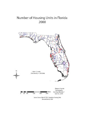
Module 7 Dot Map housing density on S drive


I am so excited! I learned how to make dots into symbols and use them to copy from the symbol library into my document. Saved a lot of time, but does not look as evenly distributed as some of the other maps. Having dots in symbol blocks of 20, 18, 8, 10, 5, 3 and 2 made it go much easier for me. I had put off doing this map because I knew there was an easier way than I was doing with one dot at a time. There is a way to copy with the spray tool and one of the other tools but I could not keep a good count. With the symbol tool, I was able to spread them out a little, yet keep a count. I can see the aesthetic value of individual placement but found the symbol tool helped me to get caught up with my work and class load.

I re-read one of my previous posts and remembered pdf files are too large so I had to export as jpg insted of save as pdf!!! The map is also posted on the S drive.

I calculated the Housing density (housing units/total area) in the excel sheet by adding a column and using the formula. The highest density is Pinellas County with 793 units standardized by area. That compares to a low in Lavayette, Liberty and Glades County with 4 to 6 units/acre density.

In order to get 173 dots into the Pinellas County space, I sized them at .7 x .7 pixels. I kept the water and wetland layer on to assist in dot placent, near coastal areas and urban centers. After placing dots, I turned off the lables and wetland layers. I left the water layer to see where the housing density is in relation to the water.

Module 10 Georgia mean annual precipitation map


I got more experience with pencil and pencil eraser tool. Inserted text and rotated. Where are the ESRI north arrows? I could not find the info in the blogs or labs but I know you told us before. I had a hard time with the lines but found warp to curve them to fit in other directions. Cool tool!

If forgot it must be exported to a jpg file format. PDF is too large to transmit. It says internal error. I also saved it to my s drive.

Monday, April 20, 2009

Module 5 Choropleth black and white

I learned to use the slider bar with the color select option. I also discovered that the states could be selected and highlighted with the shift key. The percent change legend is continuous so the color bars are next to each other. I did a lot of the work in Arcmap and then spentmore time on converting it in AI.

Module 5 Choropleth map color

I found out I could not upload my pdf files as they are much larger. Instead, these are exported as jpg files.

I set the 5 natural breaks and colors in the select tab. Once I moved it to AI I determined that I could use shift and then select multiple states with the same color instead of having to set the color value for all 50 states individually. Yippee!

I used Albers Equal Area Conic since the extent was above the equator, mostly east and west and I wanted equal area so Alaska had a more natural shape. Higher values are set in the darker color for emphasis. Legend boxes are continuous. I was able to save this map, convert to gray scale color ramp and select colors in AI similar to those in Arcmap.

Sunday, April 19, 2009

Module 9 Immigration Flow Map


I had so much trouble with this. I am so tired and frustrated from working on AI. The VM or Adobe kept freezing up and it takes so long to reboot and get back on the system.
This map is a Robinson Projection rotated so the central meridian is -100 to put USA in the middle of the map. I could not get the text labels on the continents. It kept highlighting the wrong countries. I never tried to split the continents. I had so much trouble with the select, line, pencil tools. I could not get the text to line up in the legend. I did finally get some arrows but even following the directions, the video and instructions from 2 books, I could not get them to work like I know they can. I never was able to get the size into the legend. I used 50 pt for the largest and used the formula in the lab and got .25 for the smallest width line. I used an exel spreadsheet to do the calculations.
Width of line= (max line width) x (value/Max value)
I had a horrible tiime getting the countinents to change color. Some had open white polygons so I used the blob brush to fill in. I used the lasso but still had adjacenet countries select. I could not get the background to change consistently. I learned to save colors to the color swatch and leared to use shift key to help me highlight (aka select) the bulk of the countries.
I figure I spent 16 hours on this map and still not the way it should be.

Saturday, April 11, 2009

Module 8 Non-contiguous with overlap


How do you clean up all the congestion in Europe? I finally experimented and got circles hollow.

Module 8 Contiguous cartogram


Not sure of what to include in the legend. Since you must assume the audience is familiar with general world geography, do you really need north orientation and scale? I used 10 iterations. I am not sure how to "balance error and distortion". Is there some standard to go by? I was trying to make it look like your example.


How do you include a square with the gdp value as in figure 19.2 on page 357 of text?